
Utilities 🚀
Your all-in-one solution for essential online tools!
Explore Our Tools 🛠️
Visited 58 times, 1 visit(s) today
Your all-in-one solution for essential online tools!
 Mahindra Thar price in Nepal 2024: The Ultimate… August 7, 2024
  10 Best Free Unblocked Music Sites to Listen to… May 26, 2020
 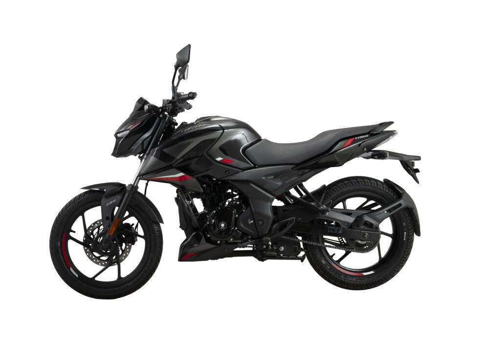 Bajaj Pulsar N150 Price in Nepal – 2025 Jan… October 6, 2023
  Yamaha FZ V2 Price in Nepal with Specifications… October 10, 2023
  Intel Raptor Lake Next Launch Expected in 2027 October 9, 2026
 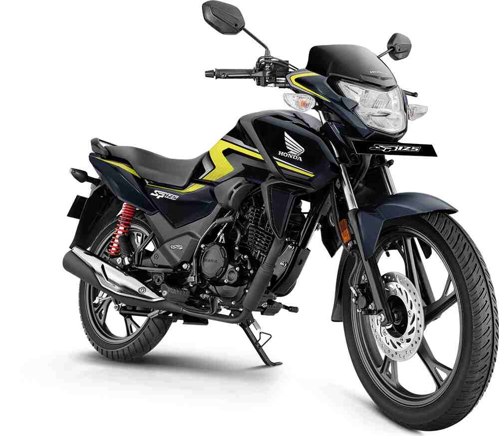 Honda SP 125 Price in Nepal (2023 Dec Update) October 18, 2023 Notebook Prices to Rise as 2027 Demand Slumps October 10, 2026 GMKtec EVO-X5 Pro: A $6,399 Powerhouse Mini PC October 1, 2026
  Everything you need to know if NTC SIM Blocked /… July 23, 2020 Nvidia RTX Spark vs Apple M6: The Ultimate Hardware Showdown September 26, 2026
  Mahindra Thar price in Nepal 2024: The Ultimate… August 7, 2024 Bajaj Pulsar N150 Price in Nepal – 2025 Jan… October 6, 2023 10 Best Free Unblocked Music Sites to Listen to… May 26, 2020
  YouTube Downloader. Download videos from… November 26, 2020
  Tata Punch EV Price in Nepal 2024: The Future of… September 5, 2024 Too many free trial accounts used on this machine.… April 20, 2026